HOW TO WRITE CUTE STUDY NOTES
So first things first, I want to let everyone know that you don’t need any fancy pens to make your study notes pretty. In fact, I pretty much just use an Artline pen in the sizes 0.4 and 0.2 mm. I also just have some plain ol’ Jane highlighters too, but the ‘study note gurus’ use the Zebra Mildliners (which I totally want to get my hands on!); these are just highlighters in really pretty pastel colours and I believe that they are transparent so it makes it easier to see your writing. Some other supplies that I use are my trusty Staedtler triplus finliners in the size 0.3 mm, some Faber-Castell grip colour markers in the size 0.6 mm I believe, and some simple ballpoint pens. Ok, so now that we have got that all sorted, let’s move on to the note taking techniques!
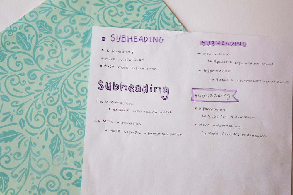
So, the first things that you need to know is how to pair fonts together. It looks really nice if you use cursive fonts with more ‘blocky’, simple fonts, otherwise it’s a whole load of fancy in your face. You get me? It also looks great if you pair a bold, thick font with a classy lower-case type. To be honest, if I’m ever in doubt or am not too sure what to do, I always pair a cursive script with a ‘tall and skinny’ or some block lettering, and also opposites attract so don’t be afraid to try something new!

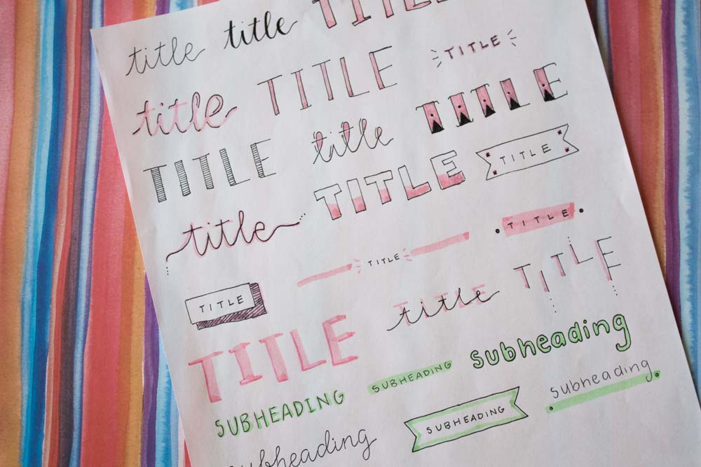
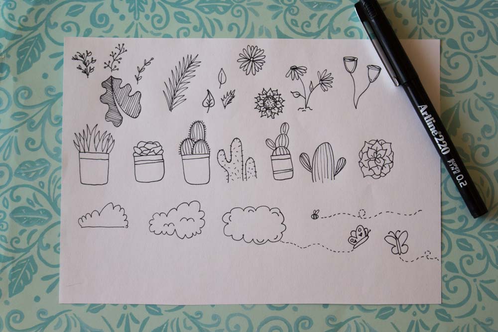
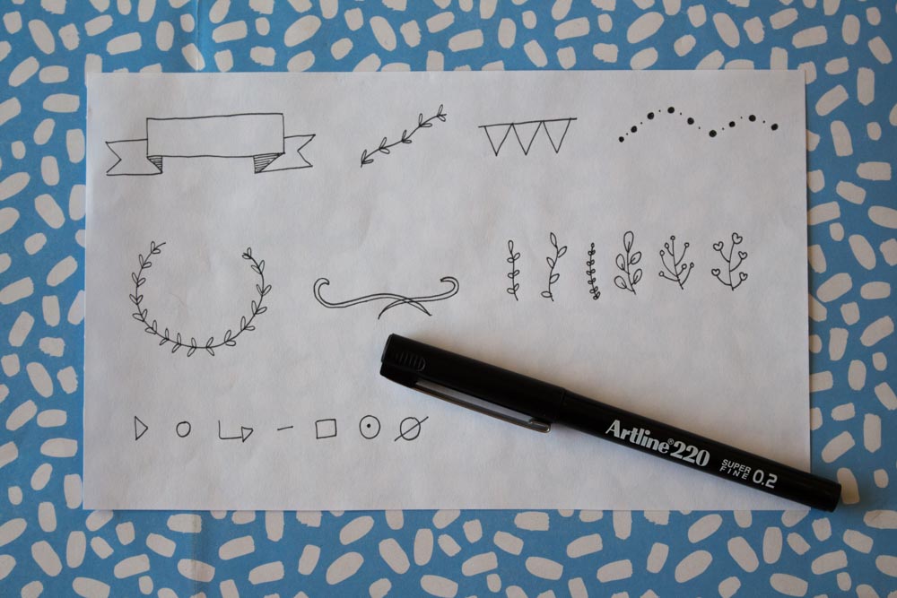
It also looks super classy, yet cute if you incorporate some sweet accents with your lettering. You might choose to place the writing inside a banner or you might want to add some strips of highlight beside it, under it or even above it. Another accent that’s cute is if you draw a box with a drop shadow, this could either be a solid colour or it could have stripes inside it. Another idea is to do some bunting with the letters inside. If you decide to use a cursive font, you can still do a drop shadow on that! Some more classic accents are the leafy and twiggy designs. You can get incredibly creative with these doodles. You can draw some basic fern-like leafs, a wreath with leaves or flowers, some branches, some cacti or succulents or even some pot plants.
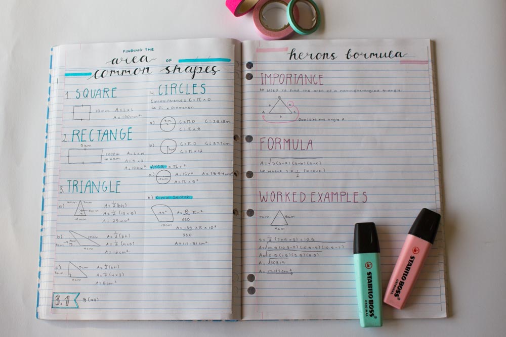
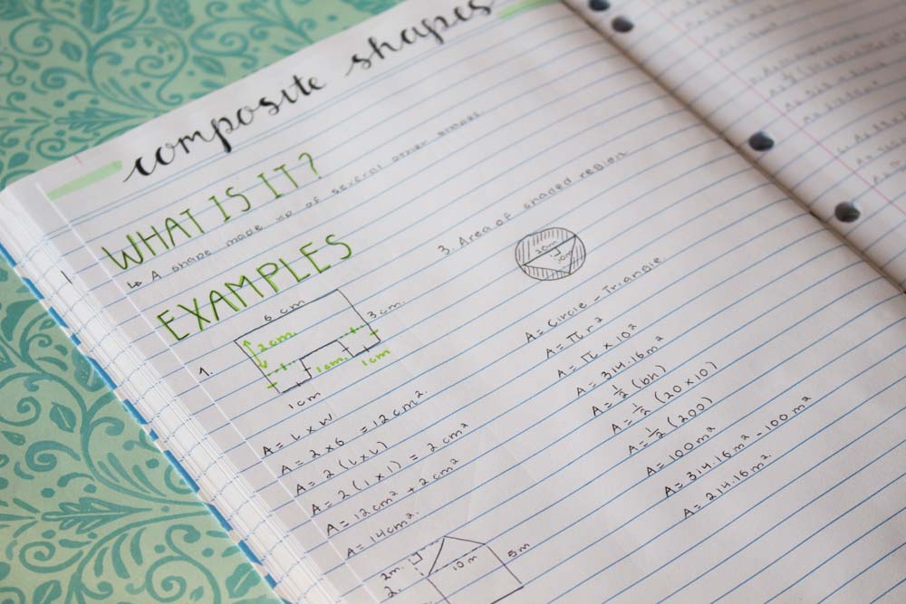
Below, are some of my notes that I have recently jotted down. We have been learning about measurement in math recently where I have to remember a bunch of formulas and shapes and by taking pretty notes, I thought it would help me remember them. So, as you can see, I really like the look of a cursive font as the main title and a coloured tall and skinny lettering that coincides with the accent colour of the page. On this note, it is really important to have a colour scheme. I usually only use a black pen and then a coloured highlighter, for example a purple highlighter and then I would find another purple pen for important information. You don’t want about fifty different colours though because it can get quite cluttered and confusing. For note taking especially, I like to have a simple spread as I feel like I can concentrate more and it isn’t too distracting.
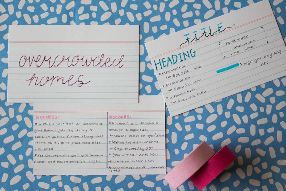
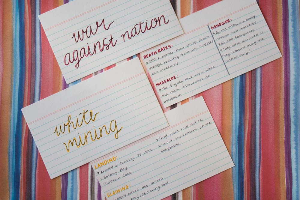
The last thing I will show you is how to take notes on palm cards. So, you would have your main title positioned on the top center, the heading on the left with a bunch of dot points underneath, you will have any super important information in a little box on the right and you will highlight any key information. Another method is to use flip-cards. You will have cursive lettering on one side, being the main topic of the card, and then you will have subheadings in an all-caps font and information below that.