BULLET JOURNAL – SEPTEMBER FLIP THROUGH
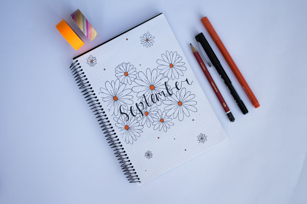
September has come to an end and I thought what better way to recap then to show my bullet journal spread for the past month. What is this ‘Bullet Journal’ you might ask? Well according to the guy Ryder Carroll who designed the system, it’s a customizable organising system that enables you to jot down to-do lists, plan your week, keep a diary and most likely, all of the above. So, this was actually the first month I ever used the bullet journaling system and I found that I was really motivated to plan out my week as I could be creative. The September cover page that I sketched out was inspired by a YouTuber known as AmandaRachLee. Her bullet journal videos were what inspired me to create one of my own. So, this cover page was formed by drawing the entire image out before outlining it in a black pen and the floral scheme was a symbol of spring. I also only used one accent colour, that being orange, because again, I was playing it safe by mirroring Amanda’s design.
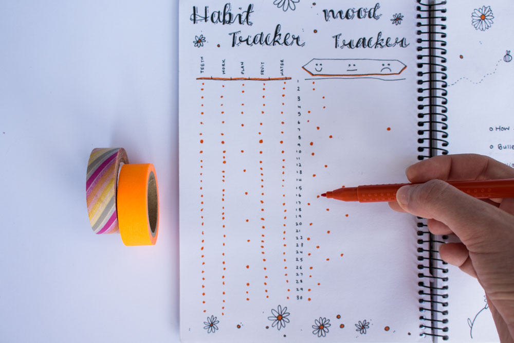
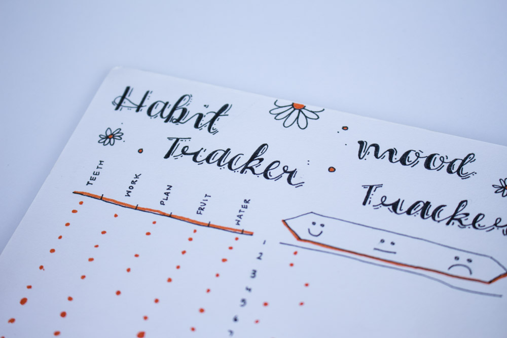
The next part of the spread was the habit tracker and the mood tracker. I wasn’t exactly motivated to use this page because the design was quite restricted and formal. The habit tracker was created to keep track of my daily needs so I had numerous sections such as water, fruit, plan, homework and teeth to draw a little dot underneath, when it was completed. The mood tracker was similar in that there was a sad, okay, and happy section and I was to place dots where my mood corresponded with the date. The actual header was drawn in a faux calligraphy font with a line and dot drop shadow. I usually do the shadow in the inner parts of the letter on the left and a shadow on the outside of the letter, on the right side. I also added some daisies, orange circles and dots around the lettering to add some decoration.

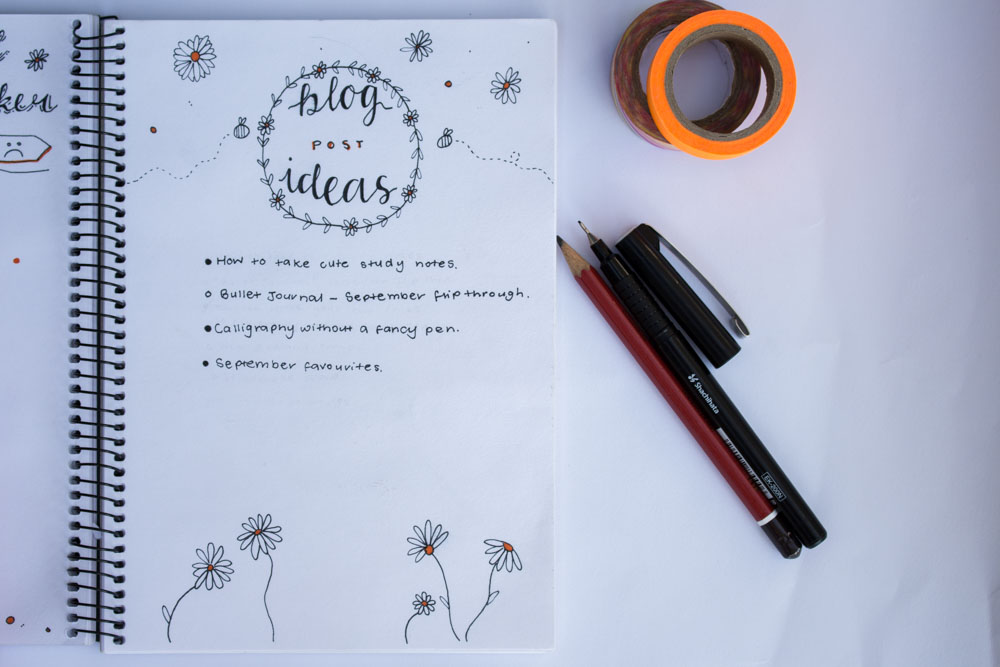
The other side of the page had a blog post ideas section which I used to jot down any posts that came to my head that month. I kept the center of the page plain and completely white so that there was space for my ideas and I made the top and bottom of the page exciting with little bees flying around and more daisies with the orange accent colour. The main header of the spread was encased in a leafy wreath that had some more tiny, orange daisies.
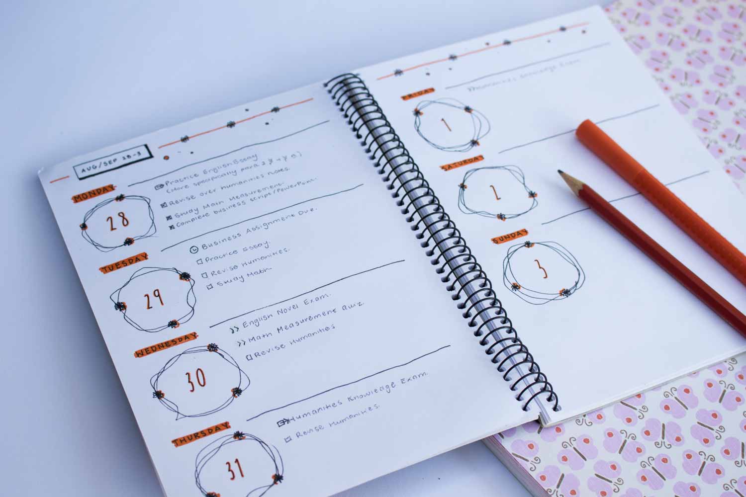
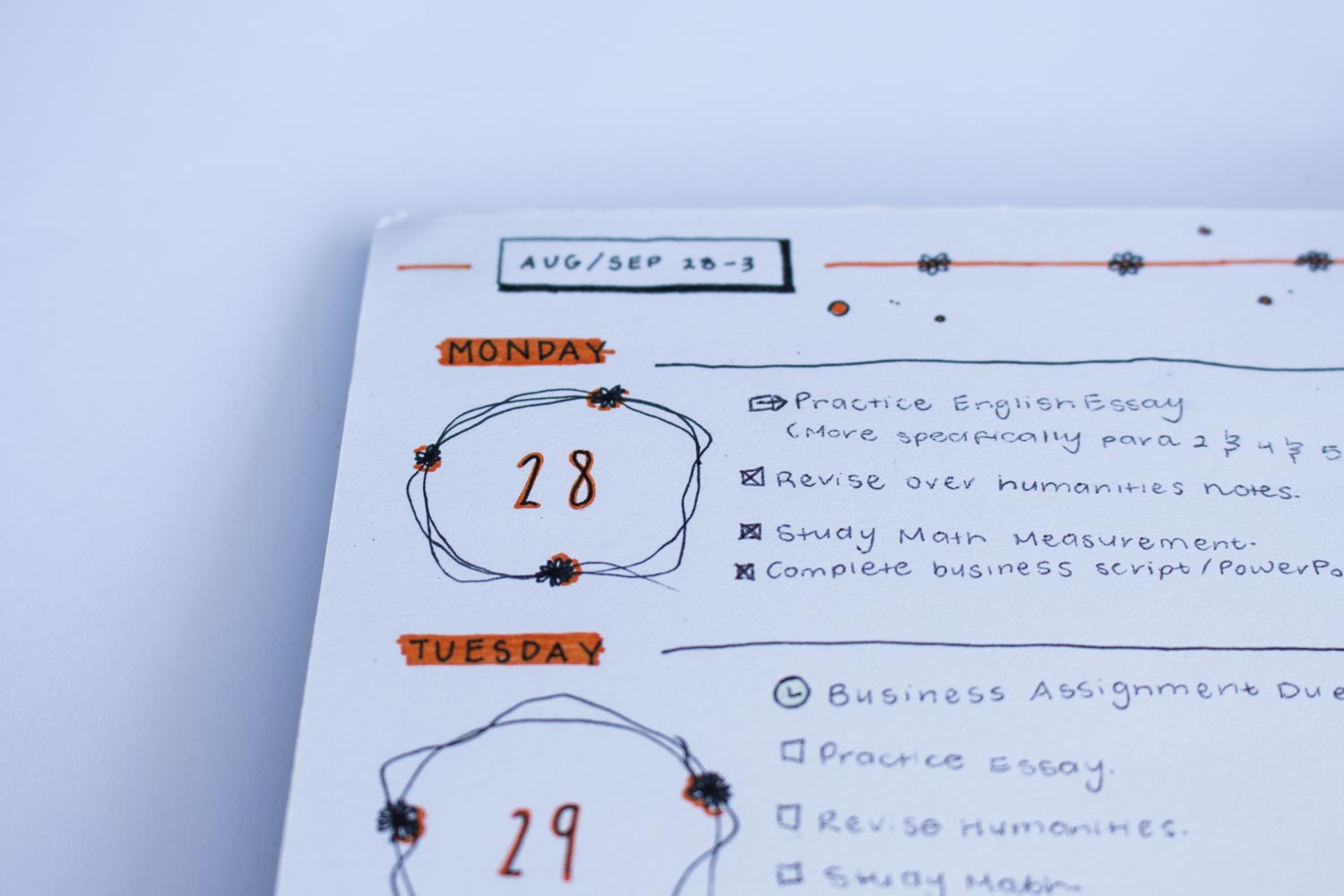
Finally, the weekly spreads! OK, this was my first week I planned using the Bullet Journal system so it was full of experiments. This week I tried to keep it really simple by including a box with a drop shadow that describes what month it is and the dates throughout the week. On the right side of the box, I added an orange stripe with more small daisies and dots around it. The dates of each day were encased in a scribbled wreath with tiny black flowers layered on top. I divided each day with a simple line and that was basically it for the week!
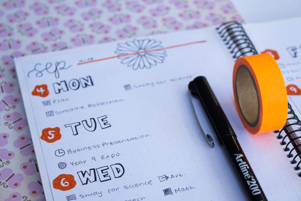
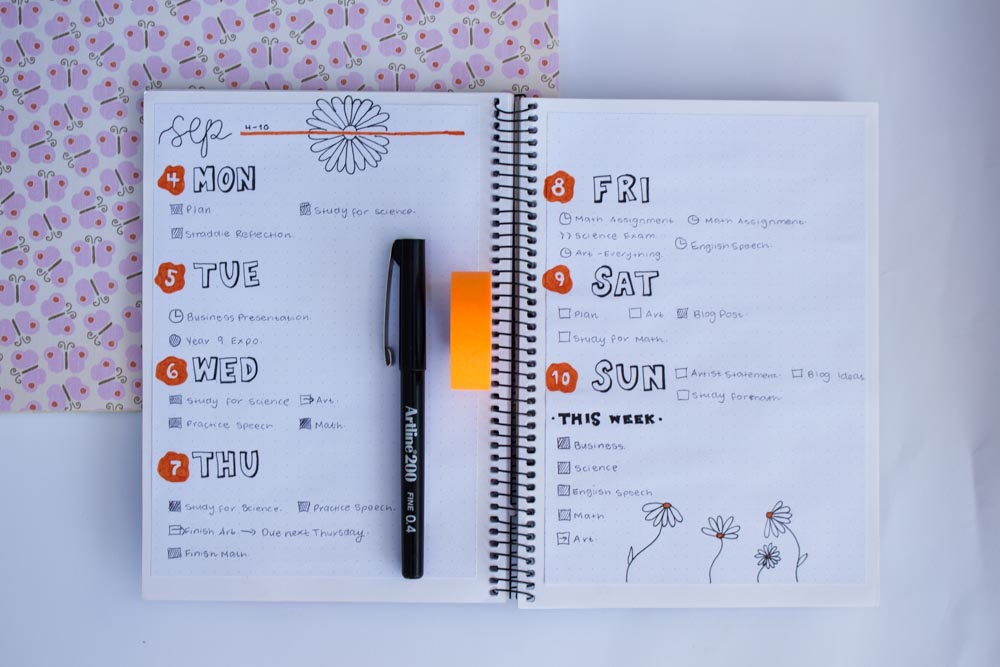
I decided to go for something a little more bold this week, as you can see through the text and the orange numbers. At the top of the spread, I wrote the month in cursive lettering with an orange line going across the page. Above the line, I jotted down the dates throughout the week and added a daisy behind the line. The days of the week were sketched in block letters and I then proceeded to add in a cheeky drop shadow to make it stand out against the rest of the spread. The numbers were encased in a blotchy circle with the orange accent colour, as throughout the entire month. This week was very busy for me as I had about 500 exams and assignments due so I added a little ‘This Week’ section at the end of the spread to keep me organised and so I could see visually what I needed to achieve. To wrap up this weeks page, I drew some daisies with the orange center.
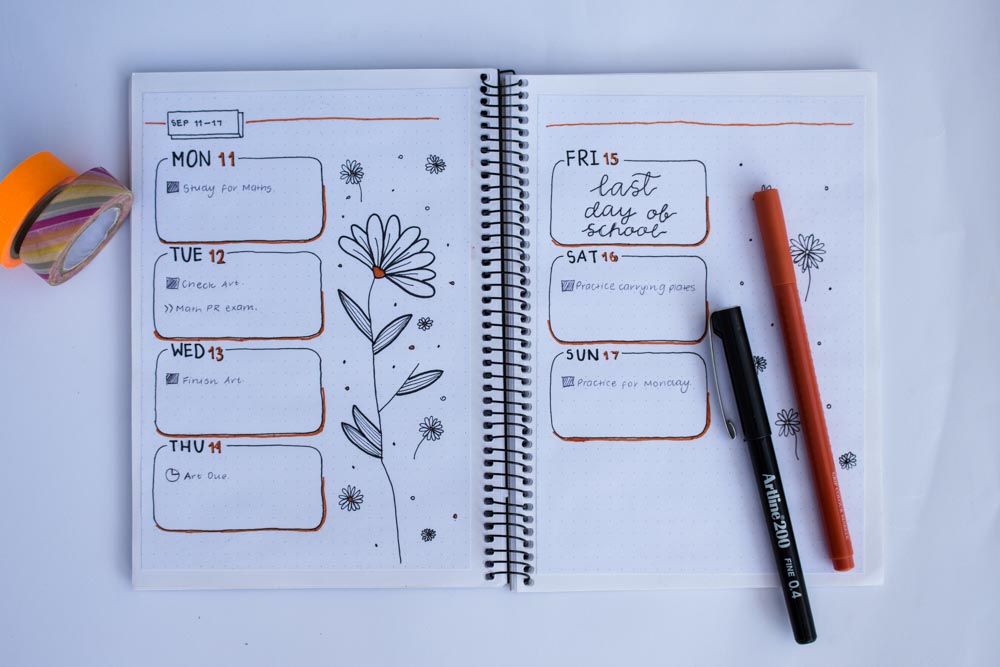
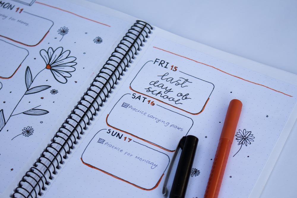
This was my favourite weekly spread in the entire month! Alright so, this week was a little bit more low key than the last so I decided to keep it really simple and have more room for doodles. At the top of the first page, I included the month, the dates throughout the week (as always) and an orange line spreading across the two pages. The daily sections were broken into little boxes with rounded edges and an orange drop shadow, including a gap at the top for the days of the week and the date. The date was coloured in the orange accent colour and I also added a simple drop shadow to make it stand out a little more. Beside the daily section I drew a large daisy (which I’m pretty sure was inspired by AmandaRachLee) with smaller flowers and dots surrounding it. Similar to the other side, I also included some small daisies next to the daily section, however I didn’t sketch out a large flower because… I mean that would just be a bit too repetitive. The next few weeks, I decided to use the same layout so I won’t be showing you that but get excited for October’s month because I went a little overboard!


Great little blog happening here!